
At the risk of sounding like a cliché, I've always appreciated title sequences, rather, animated title sequences. The first time I watched Spielberg's Catch Me If You Can I was absolutely enthralled by the title sequence. Specifically how the animation morphs from one thing to another while carrying the themes of the films in a very tongue in cheek way.
Frankly I didn't know that title sequences were actually a thing. I think I always took it as a matter of the director's creative license. Which, in all fairness it is, but I didn't know it was actually a convention with very distinct styles that are reiterated throughout films (e.g. Saul Bass). In hindsight this isn't surprising given how the title sequence tends to set the tone of the film, a visual prologue of sorts, one that prepares the audience for what's to come. Take any of the Bond films, new or old, the title sequences all insinuate what the films entail via the motifs of the film. So, to say it is important is... an understatement. I was over the moon when we went over it in class. It was very much a "so that's what they are!" moment.
There are so many notable animated title sequences I could talk about in this blog post. There's Monsters, Inc. (2001) which appears simple but is quite complex, and beautifully so. There's Birds of Prey: And the Fantabulous Emancipation of One Harley Quinn (2020), although I haven't watched the film, the sequence is one of my personal favorites for the sole reason of being a brilliant spectacle of the strange, the weird, and the fantastic in its own right. I loved it so much, I'll be using it as a reference for my own title sequence, but I'm getting ahead of myself. This list wouldn't be complete without a Saul Bass title sequence. Around the World in Eighty Days (1956) truly epitomizes the revolutionary Bass-esque style.
Ultimately, I decided to cover a totally different title sequence. Being, Netflix's The Chilling Adventures of Sabrina (2018). I haven't read the comics, and the show was a little too gratuitous at times (at a certain point you gotta ask - is that much cannibalism really necessary?) but I digress.
A General Overview
Arguably, the beauty of this title sequence lies in the simplicity of it. Don't get me wrong, aesthetically, the sequence is certainly a feast for the eyes. However, you could argue that this is owed to the illustrations. Animation - wise, the movements are very simple. Pop a 2.5d parallax here, positional key framing there... and boom!
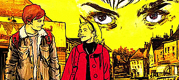
Obviously, I am oversimplifying what it actually necessitates to create the title sequence, but there is some truth in this. The majority of the title sequence seems very simple to do. I haven't seen anything that can't be animated with After Effects. Yes this, frankly presumptuous, statement is coming from someone who is an absolute beginner when it comes to Ae! Nonetheless, perhaps, this is why it is so striking. The animation is simple and straightforward. This allows a beautiful contrast with the illustrations that are both rich in color and texture.

Technicalties
As I mentioned earlier, it looks like key framing stands at the center of most, if not all, of the animation. By key framing the position, scale and warping layers, they managed to achieving this smooth yet uncomplicated animation. Additionally, there are quite a few layers, each with their own motion. This is a decidedly easier approach to moving assets like figures, as opposed to rigging a puppet in After effects (which, may not necessarily be hard per se for seasoned animators but this just seems so far way from where I am, skill-wise, so I do consider it a very complicated and skillful process)
The segment from the sequence (left) looks very busy but that's due to the many layers I spoke about, and all the minute movements keyframed with each layer.
To the left, the opening scene, stands in stark contrast to the segment (above) in terms of the lack of layers. But the techniques used here is essentially the same. Although it looks like the teeth (top teeth) shifts to and from different frames of different angles, it is simply the subject of the transform warp tool used to created this illusion of shifting angles. This same technique is used in the segment above (look at the two cobras).
A Homage
Something I found delightful was in the second to last shot in the sequence which was essentially a subtle nod to the original comics from which the show originated from. Which certainly does tie in well with the rest of the pop-art, comic-y visuals of the rest of the sequence.

I specifically loved how the character art wasn't changed at all. If I hadn't watched the show I might've suggested that this could've been a purposeful decision almost to say that the show would not diverge from the comics. Although, this isn't the case. If anything, this shows how dynamic and how title sequences can carry so much symbolism. And thus can be interpreted many ways. I won't go so far as to say that title sequences are as important as the film itself, but it's certainly close enough!
